Loaders
Loaders are used when certain elements or parts of the page could take longer to display.

Overview
Different loaders are used to communicate structure and context of the content being loaded, each one tailored to a specific use case.
| Component | Description |
|---|---|
| Skeleton | Default Loader. Used when the content on the page is known or predictable. |
| Spinner | Used as an alternative to the Skeleton loader when the content is unknown or unpredictable |
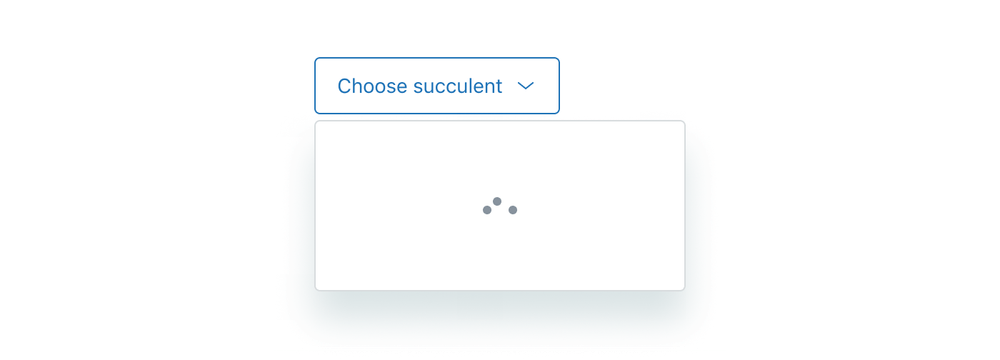
| Dots | Used inside the interface to represent a busy state. For example, inside buttons, asynchronous loading menus, or other small components. |
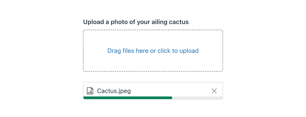
| Progress | Used for communicating progress from 0 to 100% |
| Inline | Reserved for typing indicators. |
Usage
Predictable content
When loading pages or parts of pages with predictable layout, Skeleton loader is used to show a blank stand-in version of the component that has not fully loaded. It provides a visual estimate of the space needed. This is the preferred loader in most situations as it provides a sense of progress, helps orient the user, and sets expectations on the type of content they can expect.
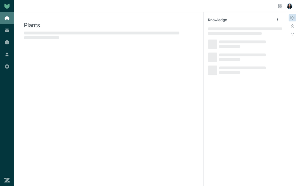
The size of the loader should approximately reflect the content it represents. Show a few skeleton loaders to orient the user, but don’t map out every element even if a page has a lot of content. Mapping out skeleton loaders in the first few elements of the header/body area are enough to convey the loading process.
Loader animation has a built-in short delay which should give time for the fast loading content to show before the loader becomes visible. Loader should be persistent until the content is fully loaded.
Use default skeleton loaders on white or light backgrounds. Use light skeleton loaders on dark backgrounds.
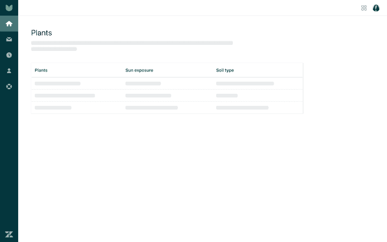
- Show a skeleton loader to orient the user
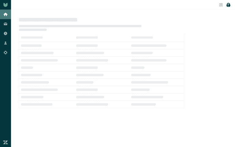
- Avoid mapping every line with a skeleton loader
Unpredictable content
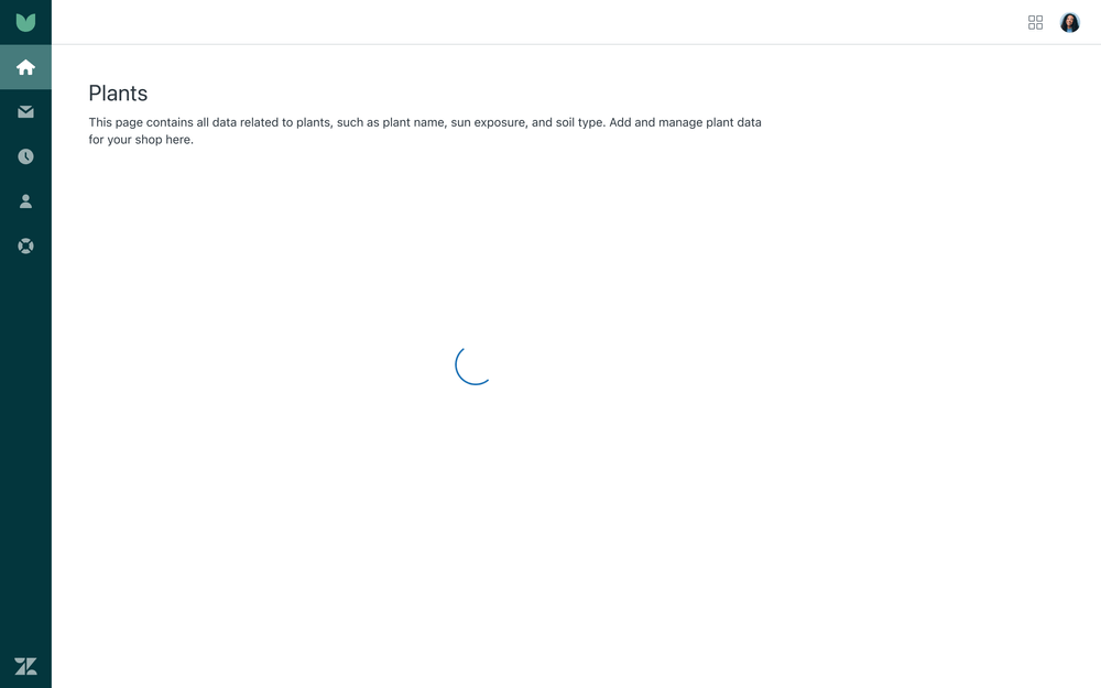
A Spinner loader is used when content is unknown or unpredictable. Spinner appears before a page is loaded to assure a user that the content is on its way. Use spinners for pages and screens or within components such as tables. Center the spinner in the container or content you’re applying it to. Spinner is also used as an alternative loader to Skeleton in situations where the content can’t be easily estimated but it’s still important to provide a sense of progress.
Completing action
The Dots loader communicates ongoing activity after a user takes an action. It tells them that something is taking place. Dots loader is used for buttons, search inputs, or other small components to indicate these components are doing something.
Use the loader for actions where it might take several seconds for the process to complete.

- Primary buttons are common candidates for using this loader
- Icon buttons are less likely to use this loader but still necessary if the user needs to be informed of the action taking place
Use the loader for search inputs if it might take several seconds to perform the query.

Use the loader for Menus where it might take several seconds to show information.
Progress
A Progress loader communicates progress from 0 to 100% when downloading or uploading content. The most common use for a progress loader is in the File upload component. Descriptive text is displayed to help clarify what is in progress.
Typing
The Inline loader is used as a typing indicator. This signals the other party is present and preparing a reply. The loader should be centered in the message bubble with other content appearing above or below.

Localization
Right-to-left languages
Some loaders are direction-agnostic, which means that they are always positioned in the same place within the context, and use the same direction for any animation elements. Dots and Spinner are examples of that.
Skeleton, Progress and Inline change direction for right-to-left languages. Skeleton animation and layout should change direction. Progress loader should fill from the right (0) to the left (100%) side. Inline animation should change direction.
Accessibility
Progress bar loaders have ARIA role="progressbar" applied to indicate the loading status, whereas Dots, Spinners, and
Inline loaders have the role of img. The aria-live property, alert role, or status role is not added by default
, but it can be extended on the component if needed. This should be evaluated on a case-by-case basis, depending on
what part of the page is loading, the speed of loading on slower connections, and other live regions on the page.
Before, during, and after loading, browser focus should remain where the user put it.
Feedback
Help improve this page. Give us your feedback